Industry
Hospitality
Client
End to end mobile application
Coastal boutique hotel
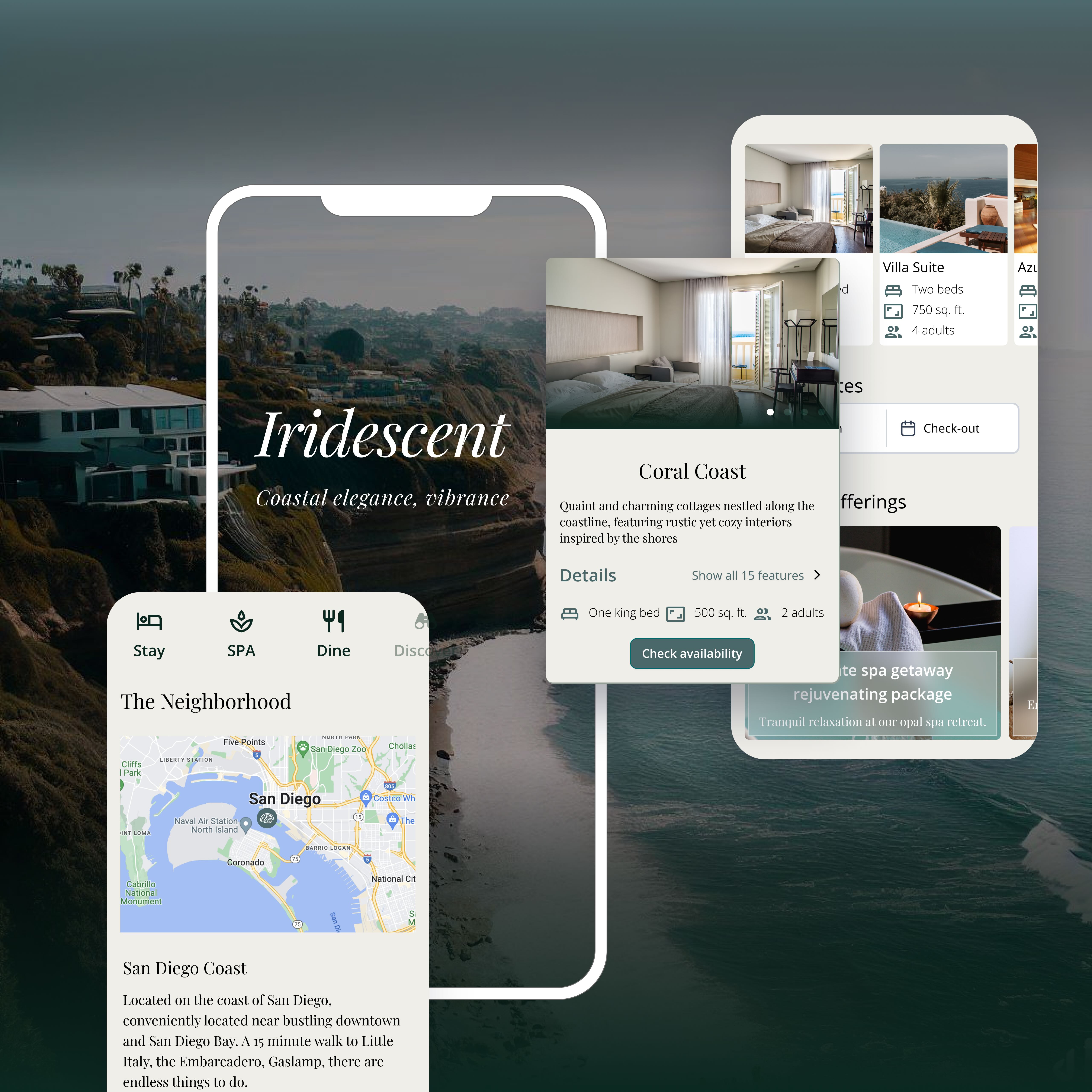
A guest facing mobile app that enhances the booking, planning and managing of service experiences received in a full service luxury coastal resort.
In hospitality, every interaction is pivotal for showcasing the brand and experience. "Iridescent" personalizes the digital experience, seamlessly weaving user autonomy, luxury, and connectedness. Positioned as a luxury resort property in San Diego with multiple outlet offerings, Iridescent aims to translate the physical to digital experience to elevate the guest’s stay and stand out from the competition. The digital experience complements all resort activities, bookings, and requests, aiming for functionality where major task flows should be reached within 2 steps. Moreover, the app also serves as a leisure magazine and blog for partnering resorts and future stays.
Core Visual Themes
Calm & Tranquil
Iridescent is a retreat enclave, a seaside and urban retreat. We are committed to creating a serene atmosphere through the typeface and the colors.
Culture & Discovery
Integrating the history of San Diego and experiences into curated tours and outings for our guests. This helps guests connect with the destination and its heritage.
Luxury & Innovation
Elevate the technology experience by pushing smart room control with modern devices. This provides additional personalized preferences and greater flexibility for the guests.

Typography
Two types of fonts was used for accenting grace and balancing legibility. Open Sans was selected to use for navigation components and major displays, Playfair Display is used for blog content along with stylistic headers. By having this contrast, we elevate the brand image while keeping readability in mind.


Logo & size
The logo is inspired by the rich history and culture of San Diego. Featuring the abalone shell, reflecting on the natural beauty and essence of the area. The graceful contours and vibrant iridescence interior symbolizes the gracefulness of the ocean and diversity of the landscape, creating a sense of fluidity and connection inherent to this coastal haven.

Colors
The color scheme is inspired by the serenity of coastal landscapes, combining the tranquility of the ocean with the opulence of a luxury resort. The predominant use of various shades of a dark Forrest Green evokes a sense of harmony, balance, and a deep connection to nature. The accent color palette aims to create a contrast that represent sand and sunstars reflected off the water, enhancing the highlights and to add warmth and brightness.

Guest Journey


Having mapped the user journey, the challenge is to make it feel luxurious and delightful, which has been prioritized due to its potential impact.
Creating the site map was crucial, ensuring a smooth flow for the numerous pages. Card sorting exercises and iterative, moderated user testing were conducted to find the right balance between visual transitions, animations, and task effectiveness.

Reimagining a delightful experience
The app emphasizes on being an all in one starting point for guests staying at or visiting any of the amenities. Pushing for direct reservations helps the resort build direct relations with its guests. This ensures the control of data, availability, and most importantly, the whole experience that the guest will go through. There is a challenge in pushing for this as guests are used to making online reservations themselves through Airbnb, Expedia or Booking.com, so how might we create an efficient and delightful experience for this process?

Inspiration was taken from magazine publications that could be found on waiting room or lounge area coffee tables, and digitizing that experience. With a dedicated blog section on the app and the ability to introduce animation and clips, the content was made to be much more lively and engaging with the potential guests.
By taking a page out of luxury sales books, guests are invited to browse a catalog, learn more about the destination, at their own leisure time, creating a immersive and contextual atmosphere.

Incorporating features
The guest experience flow was established and laid out. High fidelity prototypes were built and tested iteratively, with special consideration given to ensure the app conveys the right feel. This is crucial for the brand image, as it should reflect the sophistication and excellence of service expected from the clientele and price point.

Effortless Check-in and Identity Verification
Mobile check-in allows guests to bypass the front desk.

Guests are able to complete these steps at the comfort of their own home, or on their way to the resort. Notification is sent out when rooms are ready. Guests will then be directed towards the in stay screen when completed.
Booking by room type or availability
View and book based on guest preferences

Users can browse room types, packages, amenities. They can filter and toggle based on their travel needs. Pre-saved credit card information allows the guest to check-out easily to confirm their booking.

In room control & amenity viewing
Guests can open their room, common gates and more with the mobile key.

Guests can access the guest room amenities and controls anywhere they would like. Streaming Youtube, Roku or other devices can be done from the phone.
