Industry
E-commerce
Client
Webpage Redesign
Landing page redesign
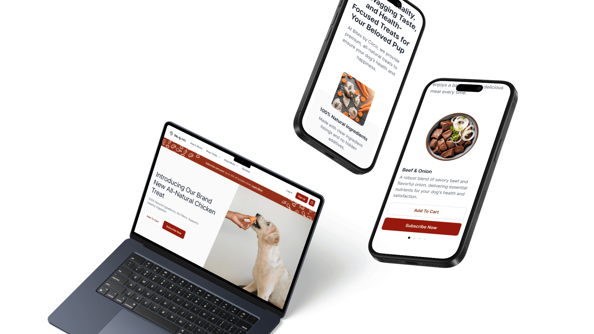
Redesigning the landing page for Bites by CoCo
The company was set to revamp their existing ecommerce site to attract, target more users and drive business results. The assignment was requested to be completed and handed off with an allocated budget of 40 hours.
Task Review & Audit
Comprehensive heuristic evaluation of the landing page. I utilized the PRICE framework - checking for:
Persuasiveness, is the website compelling for the user?
Relevancy, does this meet user expectations?
Interference, is there anything distracting on the page?
Comprehension, is the information easily digestible?
Efficiency, can users perform intended tasks easily?
Click here for raw audit notes.

Questions & Assumptions
Keeping the goals and tasks at hand, I had to narrow down my approach to what is doable on the agreed upon timeline. Certain questions were raised and assumptions were made in an effort to take initiative and guide design decisions.
Main driver of business
Bites by CoCo is looking to expand its subscription services.
Brand & marketing
Boutique premium e-commerce segment - a quick research show that healthy dog food products are typically bought by millennials, or Gen Zs.
Focused on the landing page
I opted to explore and do a deep dive on only the landing page, leaving out the site architecture and nested pages.
Still looking to grow
The company has some early adopters, but still looking to grow its user base and connect with their demographic base.
Research & Analysis
With the assumptions set, I embarked on secondary research to evaluate what is currently in the space of pet food subscription services. I wanted to understand best practices, market trends, and identify any gaps as opportunities.

Some key findings synthesized from the competitive analysis table:
We want to show the why
Features are typically highlighted on landing pages in the competitive field.
Promotions are a big thing
Emphasizing value is key. Lots of call outs, pop ups, showing where you can save and how much.
Guest cart feature is not popular
If you are not signed up, there is quite a lot of friction getting an order out the door. This might be an opportunity.
Show credibility with testimonials
Reviews, veterinary approved, social media posts all show who stands behind the product.
Design & Iterations
I began the design process by incorporating the insights I had gained, ensuring that each design decision was informed by the learnings prior.
Click here for HiFi redesign screens
Click here for prototypes


User Testing Findings & Next Steps
After the redesign, I completed a round of unmoderated survey with dog owners (the outlined demographics group) to see whether the goals of each task was achieved. The summary of the results are shown below:
Click here for the results *Note that mobile devices cannot view results at this time.
Branding
The overall redesign of the branding, images, and style appears to resonate well with the user base, aligning closely with the key words provided.
Transparency
Our new landing page presents information in a user-friendly format that is easy to understand. 100% of testers said it was easy to identify the product features.
Activating subscription could use more work
Users are not compelled to purchase subscriptions - further testing could include having trial windows, additional information on subscription details, cancellation window. The addition of these could help conversion rates.
Pulling additional data
After implementation, surveys could be built into the page along with trackers to evaluate behaviors of users further. We can then further dive into what percentages of users subscribe to 10% versus 20% to shape business decisions on how to grow the business further or pivot their strategy.

